What are the principles of visual hierarchy in graphic design?
When you start designing, everything might look visually appealing to you, but others may not know where to focus first. That’s a common struggle.
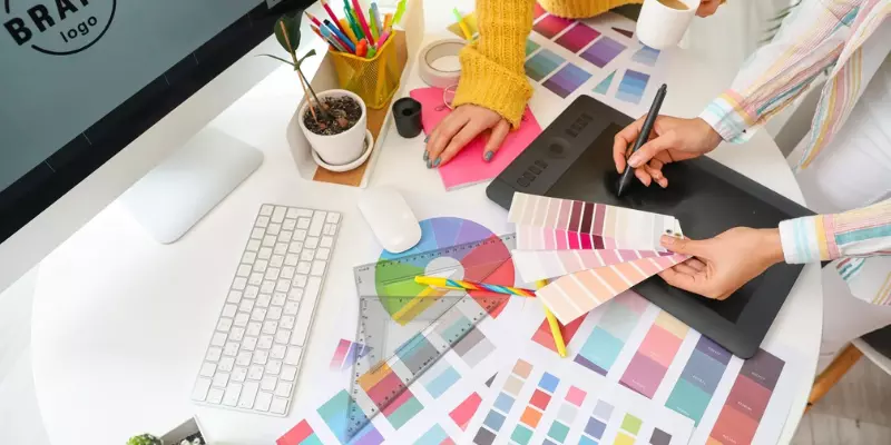
You add colors, fonts, and images, yet the design feels confusing. I noticed this early while learning Graphic Design Courses in Trichy, where the focus shifted from just making things “look nice” to guiding the viewer’s attention clearly.
Size and scale guide attention
One of the simplest ways to create visual hierarchy is by using size. Bigger elements naturally grab attention first. Headlines are usually larger than body text for this reason.
When someone looks at your design, their eyes should move from large elements to smaller ones. This helps them understand what is important without overthinking. If everything is the same size, the design feels flat and hard to follow.
Color creates focus and contrast
Color plays a strong role in directing attention. Bright or bold colors stand out, while softer tones stay in the background. Designers often use contrast to highlight key elements such as buttons or headings.
For example, a bright call-to-action button on a simple background makes it easy for users to notice what to click. Understanding how colors influence attention helps in creating more effective designs.
Typography builds structure
Fonts are not just for readability; they also create hierarchy. Using different font sizes, weights, and styles helps separate headings, subheadings, and content.
A bold heading followed by smaller text naturally guides the reader. When typography is used properly, the content feels organized and easier to scan.
This is something many learners improve through consistent practice, often supported by structured learning like Digital Marketing Course in Erode.
Spacing improves clarity
Spacing, or white space, is often ignored by beginners. But it plays a big role in visual hierarchy. Proper spacing between elements makes a design look clean and readable.
It also helps separate different sections so users don’t feel overwhelmed. When everything is placed too close together, it becomes hard to focus. Giving elements space allows each part of the design to stand out clearly.
Alignment keeps things organized
Alignment helps maintain order in a design. When elements are aligned properly, the layout feels structured and professional. Whether it’s left alignment, center alignment, or grid-based design, consistency matters.
Misaligned elements can make even a good design look messy. Keeping everything aligned helps guide the viewer’s eye smoothly from one section to another.
Read: Best Graphic Designing Company in India
Position and layout matter
Where you place elements on the screen affects how people read your design. Important content is usually placed at the top or center because that’s where users look first. Supporting details can be placed below or around it.
Designers often follow common reading patterns like left-to-right or top-to-bottom. This makes the design feel natural and easy to navigate.
Understanding real-world expectations
In real projects, visual hierarchy is not just about creativity, it’s about communication. Clients and companies expect designs that clearly deliver a message.
Whether it’s a website, poster, or social media post, users should quickly understand what to do or read. As demand for design skills grows, learning how to apply hierarchy effectively becomes an important part of building a strong portfolio.
Designing with visual hierarchy in mind changes how you approach every project. Instead of placing elements randomly, you start thinking about how users will see and understand the design.
Over time, this improves both your creativity and communication skills. Exploring structured learning paths, such as Graphic Design Courses in Erode, can help you refine these concepts and apply them confidently in real-world work.