Top Design Tips for Creating Stunning Full Color Labels
Full color labels for product packaging tell your brand story and grab attention. When designed well, it can make your products stand out on the shelf instantly. However, if it is dull, the product can go unnoticed.
If you would like to create full color labels that look impressive and leave a favorable impression, here are the tips you can follow.
1. Use High-Resolution Images
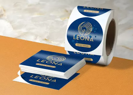
One of the top advantages of full color roll labels is that they include detailed imagery. But pixelated or blurry graphics can ruin the whole look of the label. So, it is essential to ensure that you use high-resolution images. Go for the ones that are 300 dpi or higher. It makes the image appear sharp and clear after being printed.
If your labels include intricate patterns or photographs, test how they look after being printed. What appears vibrant on a desktop might look different in print based on the color profile used.
2. Focus on Readability
The product roll labels must be easy to read, even from a distance. Select fonts that are legible. Usually, sans-serif fonts work well for minimal and modern designs. It gives a sophisticated touch to the product labels.
Don’t use too many fonts on one label. Choose a maximum of three complementary fonts. Ensure the text size is correct. Product name and important details must be larger, and secondary information can be smaller. Adequate contrast between background and text plays an important role in readability. Choose dark text for a lighter background and lighter text for a darker background.
3. Choose the Right Material and Finish
Even the most beautiful design falls flat when printed on the wrong material. The gloss, texture, and durability of the custom roll labels affect both performance and aesthetics. Glossy finishes give a vibrant touch and matte finishes offer a more sophisticated, subtle look. Don’t forget to consider the environment in which your products are going to be used.
Go for waterproof materials and finishes. If you want the labels for luxury items, foil or metallic accents add a premium feel. The right combination of finish and material improves your design and makes the label more appealing.
4. Ensure Proper Color Balance and Contrast
The good thing about full color custom roll labels lies in their vibrancy and richness, but it is essential to achieve the right balance. Too many bright colors can be overwhelming, but muted tones can fail to grab attention. So, you must balance subtle and bold shades to create visual harmony.
Test the design with different lighting and print samples to ensure the colors you have chosen appear as intended. Proper contrast helps important elements like your brand name and logo stand out. Complementary color combinations also guide the eyes of the viewers across the design naturally. This makes it more engaging.
5. Highlight Key Information
Your label should include important details quickly, such as brand name, product type, and special features. Place the elements where the eyes of the customers land first naturally, generally at the upper section or center of the label. Supporting details, such as ingredients and usage instructions, should be organized neatly where they do not distract readers from the main design. Take your label roll as a mini advertisement.
6. Keep Consistency
If your brand provides multiple products, maintain consistency with the design is key to building a strong brand identity. Use a unified color palette and font style across all your labels. Consistent design enhances brand recall and gives your product line a cohesive appearance on shelves. It helps your target customers easily recognize your brand.