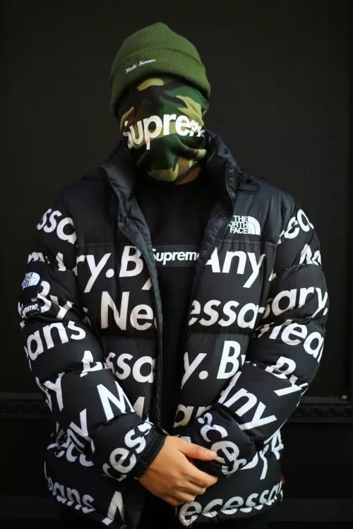
Inside Supreme's Iconic Box Logo: The Story Behind the Hype
A single red rectangle sits on a plain cotton tee, and somehow that rectangle commands more attention than most entire fashion collections. People wait outside stores before sunrise for a chance to buy it.
Collectors treat faded copies from decades ago like museum pieces, storing them away as if they were rare currency rather than clothing.
The Supreme box logo achieves something almost no other fashion symbol manages, it turns simplicity itself into a spectacle that pulls people across cities just to witness a Thursday drop. This article traces how a small skate shop's stark design choice grew into one of the most recognized marks in modern fashion history.
James Jebbia Starts a Movement
James Jebbia opened in downtown New York in 1994, and he built the store around skaters who wanted gear that matched their attitude rather than corporate polish. He avoided flashy branding at first, favoring a rougher, more honest aesthetic that skate culture already valued deeply.
That restraint eventually shaped his approach to the logo itself. Jebbia wanted something blunt and confident, a mark that skaters would respect precisely because it refused to try too hard or chase mainstream approval.
Barbara Kruger Shapes the Visual Language
Jebbia borrowed heavily from artist Barbara Kruger, whose bold text against solid red backgrounds already carried a rebellious, confrontational energy within the New York art scene of the era. Her style spoke directly to viewers, often in blunt commands, and that same directness translated naturally onto fabric.
Kruger never authorized the borrowing, and she voiced her frustration about it publicly for years afterward, calling the situation exploitative. That friction between fine art and street commerce only deepened the logo's mystique, giving it a story that felt equal parts controversial and compelling.
The Box Logo Enters Skate Culture First
Long before luxury houses noticed Supreme, skaters wore the box logo because it represented their own scene rather than an outside trend chasing their attention or their money. Skate videos, local shops, and word of mouth carried the logo's reputation across cities faster than any advertising campaign could manage.
That grassroots growth gave the symbol legitimacy that money alone cannot buy. Supreme never needed billboards because skaters did the marketing themselves, wearing the logo as proof of belonging within a culture built firmly on authenticity.
Hype Culture Discovers the Symbol
As streetwear gained mainstream traction through the 2000s, the box logo transformed from a niche skate signifier into a broader status marker that reached far beyond skate parks. Limited quantities and unpredictable release schedules created genuine scarcity, and scarcity pushed demand into territory few brands ever reach.
Resale markets exploded around the logo, with simple tees fetching prices that rival designer jackets from established fashion houses. That economic shift proved the symbol carried value entirely independent of the garment underneath it, a rare achievement in modern retail history.
Read: Top 5 Clothing Brands in 2025: Style Meets Streetwear
Collaborations Push the Logo Into New Territory
eventually placed its box logo beside names that once felt worlds apart from skate culture, including Louis Vuitton and Comme des Garcons, brands built on heritage rather than rebellion. Each partnership tested whether the logo could hold its identity next to established luxury symbols, and remarkably, it usually did.
Some collaborations divided longtime fans who felt the brand drifted from its roots into pure spectacle. Yet even those disagreements kept people talking, and controversy, it turns out, only reinforced how much cultural weight this small rectangle carries across generations.
Why the Box Logo Still Commands Attention
Modern brands constantly redesign their logos chasing relevance, yet Supreme's box logo has barely changed since its earliest appearance decades ago. That refusal to evolve visually gives it a rare consistency, allowing fans across generations to recognize it instantly without confusion or hesitation.
People value stability in a marketplace obsessed with constant reinvention. The box logo endures because it never tried to become anything other than exactly what it always was, a stark, confident statement that trusts its own simplicity completely.
How Scarcity Keeps the Logo Relevant
Supreme releases the box logo sparingly, and that scarcity does more work than any campaign could accomplish on its own. Fans learn to expect unpredictability, checking release calendars obsessively because missing a drop often means waiting months for another chance.
This deliberate restraint separates Supreme from brands that flood shelves hoping volume will sustain interest. Scarcity forces desire to build naturally, and desire built slowly tends to last considerably longer than desire manufactured through constant availability.
The Legacy Supreme's Box Logo Built
Few fashion symbols manage to feel simultaneously rebellious and prestigious, yet Supreme's box logo occupies that unusual space with total ease. It began as a skate shop's blunt design choice and grew into a cultural shorthand recognized across continents and generations alike.
That journey from downtown New York sidewalks to global fashion runways captures something larger about how authenticity, scarcity, and cultural timing can build lasting influence. The red rectangle keeps proving that genuine impact rarely needs elaborate design, only conviction and the patience to let a culture claim it as its own.