Designing for Distraction: How to Win Attention in a Crowded UK Marketplace
In 2026, the British consumer’s attention is the most expensive commodity on earth. With 95% of UK adults owning a smartphone and checking them up to 100 times a day, we have entered the era of "Continuous Partial Attention."
For brands, the challenge is no longer just being better than the competition; it is about being more "interruptive" than a notification, a news alert, or a trending reel.
To win in this landscape, your visual identity cannot be static. It must be designed for distraction—engineered to catch the eye in a split second and hold it just long enough to deliver a message. This requires a shift from traditional graphic design to "Neuro-Visual Strategy."
1. The 3-Second Rule and the Death of Complexity
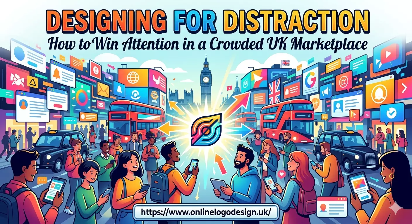
Research shows that a brand has approximately 3 to 5 seconds to make a first impression before a user scrolls past. In this window, complexity is the enemy. If a logo is too intricate, the brain filters it out as "visual noise."
The 2026 trend of Neo-Minimalism addresses this by stripping away everything but the essential. However, unlike the cold minimalism of the past, Neo-Minimalism adds a "Single Twist"—one unique, high-contrast detail that acts as a memory anchor.
When you visit https://www.onlinelogodesign.uk/, you see this principle in action: clean, versatile marks that are built to survive the frantic pace of a mobile feed while maintaining professional authority.
2. High-Contrast and "Toasty" Palettes
Color psychology in the UK has bifurcated into two distinct lanes for 2026.
- The High-Contrast Lane: Used by fintech and tech disruptors, these brands use "Digital Neon" accents against deep charcoals to physically jump off the screen.
- The "Toasty" Lane: Used by lifestyle and D2C brands, this involves warm, earthy tones (terracotta, ochre, forest green) that signal "Human-Centricity" and authenticity.
Choosing the right lane depends on your "Attention Goal." Are you trying to stop a scroll (High-Contrast) or build a long-term emotional bond (Toasty)? A specialized digital marketing agency in UK hubs will tell you that the most successful campaigns in 2026 actually blend both:
using high-contrast visuals for the initial "hook" and muted, earthy tones for the "nurture" phase of the customer journey.
3. Adaptive Systems for a Multi-Screen UK
A logo is no longer a single file; it is a responsive system. In the UK, where social commerce has increased by 44% in London alone, your brand must look as good on a smartwatch face as it does on a Leicester Square billboard.
Responsive branding involves creating "Variable Marks":
- The Master Mark: For websites and packaging.
- The Social Icon: A simplified, high-impact version for profile pictures.
- The Favicon/Micro-Mark: A tiny, recognizable dot for browser tabs and notifications.
[Image showing a logo adapting from a complex version to a simplified mobile icon]
4. The Economy of Affordability and Quality
With the ongoing cost-of-living pressures in 2026, UK startups are under immense pressure to launch fast and lean. However, cutting corners on your visual identity is a "false economy." If your logo looks amateur, consumers subconsciously assume your service is amateur too.
Fortunately, the democratization of design tools has made it possible to access high-end aesthetics without the boutique agency price tag.
For founders looking to establish a professional presence quickly, finding a cheap logo design service that doesn't sacrifice technical scalability (SVG files, vector formats) is the ultimate competitive advantage.
It allows you to invest your remaining budget where it matters most: into the performance marketing and customer service that keeps that hard-won attention.
5. Designing for "Search Previews" and AI
In 2026, your logo isn't just seen by humans; it is read by AI-powered search engines and shopping assistants. Google’s visual search now prioritizes logos that have high "Edge Clarity."
If your logo has fuzzy gradients or low contrast, it may be downgraded in visual search results or "SGE" (Search Generative Experience) previews.
To win the "Search Attention," your logo must be mathematically clean. Use bold strokes and avoid "micro-details" that disappear when shrunk down to a search snippet.
6. Kinetic Branding: Using Motion to Stop the Scroll
Motion is the ultimate distraction-breaker. Our brains are hard-wired to notice movement as a survival instinct. In 2026, "Motion-First" logo design is the standard for UK digital brands.
This doesn't mean a complex movie-style animation. It means a "micro-interaction"—a subtle bounce when a page loads, a shifting gradient on hover, or a "morphing mark" that changes shape as you scroll.
These tiny movements provide "Visual Dopamine," rewarding the user for looking at your brand and making it significantly more "sticky" in their memory.
Read: How VPS Hosting in India Is Powering a New Era of Online
7. Conclusion: The Attention-First Mindset
To succeed in the UK marketplace today, you must design with the assumption that your customer is tired, distracted, and currently looking at three other things.
Winning attention isn't about being the loudest; it’s about being the most legible and the most memorable. By embracing adaptive systems, strategic color theory, and professional-grade design, you can turn a split-second glance into a lifelong customer.
In 2026, the brands that cut through the noise are those that understand that clarity is the ultimate form of innovation.