How to Use Typography to Build a Personal Brand?
Your personal brand is more than your photos or your bio. The way you write your name, captions, and messages also shapes how people see you. Typography gives your words personality. It helps you express your style, your values, and your voice in a visual way.
Many creators use a font style generator to find text styles that match their identity. When you choose the right style, your words feel more intentional and more memorable.
Why Typography Matters for Personal Branding?
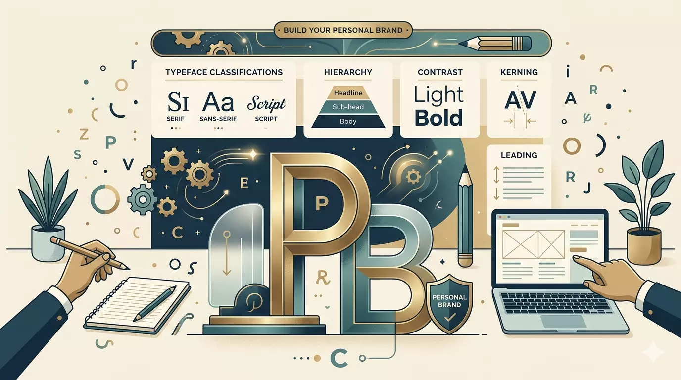
Typography is a visual language. It communicates emotion before someone even reads the words. A soft script feels warm. A bold typeface feels confident. A clean modern font feels professional.
Your font choices help people understand:
- Who you are
- What you care about
- How you want to present yourself
- What mood your content carries
When your typography stays consistent, your brand feels stronger and more recognizable.
How Font Choices Influence Perception?
Every font style sends a message. Here are some common associations:
- Serif fonts feel classic, trustworthy, and elegant
- Sans serif fonts feel modern, clean, and simple
- Script fonts feel personal, emotional, and expressive
- Bold fonts feel strong, confident, and direct
- Minimal fonts feel calm, balanced, and aesthetic
Your personal brand becomes clearer when your typography matches your personality.
Using Typography Across Your Online Platforms
Your text style should stay consistent across your digital spaces. This helps people recognize you instantly.
Use the same style for:
- Social media bios
- Captions
- Highlight covers
- Usernames
- Website headers
- Email signatures
- Digital portfolios
Consistency builds trust. It shows intention. It makes your brand feel real.
Creative Typography Ideas for Social Media
People often explore instagram font styles to make their profiles look more aesthetic and expressive. These styles help you stand out in crowded feeds.
Here are some ideas you can try:
- Use soft script text for gentle, emotional branding
- Use bold text for strong, confident messaging
- Use minimal text for clean, modern profiles
- Use playful rounded text for friendly, cute vibes
- Use vintage serif text for nostalgic or artistic themes
Your typography should match the mood of your content.
Read: How to Build a Portfolio That Gets You Hired as a Developer?
How to Choose the Right Typography for Your Brand?
Choosing the right style becomes easier when you understand your brand personality.
Ask yourself:
- Do I want to feel bold or gentle
- Do I want a modern or classic look
- Do I want my profile to feel fun or professional
- Do I want my text to feel simple or expressive
Your answers guide your font choices.
Examples of Typography for Different Brand Styles
Soft and aesthetic brands
- Use gentle script text
- Add pastel themed captions
- Keep spacing airy and calm
Bold and confident brands
- Use strong uppercase text
- Keep lines short and direct
- Use high contrast styles
Minimal and clean brands
- Use simple sans serif text
- Keep captions short
- Focus on clarity
Creative and artistic brands
- Use decorative or stylized fonts
- Mix subtle variations
- Add expressive captions
Tips for Using Typography Effectively
- Keep your style consistent
- Avoid mixing too many fonts
- Match your text to your content mood
- Use readable styles for long captions
- Use decorative styles for short lines
- Test different styles to see what feels right
Typography works best when it feels natural and intentional.
Final Thoughts
Typography is a powerful part of your personal brand. It shapes how people feel when they read your words. It helps you express your personality in a visual way. When you choose styles that match your identity, your brand becomes stronger, clearer, and more memorable.