HOW TO CHOOSE THE RIGHT COLOUR FOR YOUR DEKTON COUNTERTOP
Are you thinking about getting a new countertop for your kitchen or bathroom? Dekton is a great choice because it is quite strong and doesn't take up a lot of room. Choosing the colours for your room is the most enjoyable part of getting Dekton.
There are so many colours to pick from that it could be hard to find the correct one. For example, the Onirika line is highly expensive, while the SilverKoast collection is really classy. So, how do you pick something you'll love for a long time? Let's talk about the most important things to remember.
Why colour psychology matters in your field
Colours may change the way a room looks and feels. The Malibu and Salina colours from the SilverKoast collection are great for making a small kitchen look bigger and more open. They bounce light around, which makes the room look bigger and cleaner right immediately.
On the other hand, the new Onirika colours or the darker Dekton shades from the Pietra Kode line may make a big room look more dramatic, sophisticated, and grounded. Do you want the mood to be calm and peaceful or exciting and dramatic? The hue you choose will have a big effect on the mood.
Looking at the Dekton Colour Collections
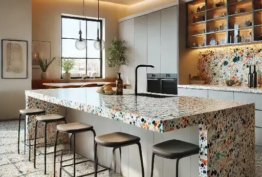
There are a number of different Dekton collections, and each one has its own style and tells its own story. For instance, the Pietra Kode series gives old stones from all over the world a new look that is both modern and classic. People who prefer designs that seem like marble will love the Onirika series.
The patterns and veins are so clear that they look like true art. There could be a colour in this group that looks like Dekton Morpheus. It has a one-of-a-kind finish that is almost clear and has a lot of depth. This is an excellent option. The Dekton worktop is a great alternative if you want something more rustic or industrial. Oxidised steel looks both nice and natural. Modern kitchens with a Dekton Trilium worktop feel like they're in the city.
How to Get Your Cabinets and Floors to Work Together
The room should have more than just a Dekton countertop. It should be the same hue as the cabinets, floors, and walls you already have or want to have. This is an important part of keeping the design the same. Black cabinets will look great with a light-colored Dekton worktop colors. It will add interest and activity to the region. Using colours that are comparable in tone can also help you look fashionable and attractive.
You should definitely get samples of the Dekton colours you prefer and examine how they look in your home in different kinds of light. This lets you observe how the hue of your kitchen changes throughout the day while the sun is out. The light in your house, whether it's natural or artificial, can make a colour look different than it does at a store. Take your time with this step; it's worth it to do it well.
It looks nice, but it's also useful and will endure a long time.
It's important to look attractive, but don't forget that a Dekton worktop is also a good investment because it will endure a long time and be useful. The small things don't scratch, alter colour, or become too hot, so they're great for kitchens that are often busy or places where people walk a lot. Your new worktop will be able to handle everyday use, no matter what colour you choose. It could be a bright, vivid colour or a plain white colour.
The new colours in the Pietra Kode and Onirika collections not only look great, but they also provide you the same peace of mind that Dekton is known for. The colours of the Dekton worktop will make you happy for a long time. The ideal hue is the one that makes you smile every time you go into your kitchen.