How Color Psychology Influences Branding and Web Design
Colors do more than make a website look attractive. They shape first impressions, guide attention, and influence how people perceive a brand.
Every color can create different emotional associations. However, these responses depend on context, culture, industry, personal experience, and surrounding design elements.
For that reason, illustration design services often use carefully selected palettes to strengthen visual stories and support brand identity. The right colors can make digital experiences feel clearer, warmer, stronger, or more trustworthy.
Why Color Matters in Branding
Branding creates a recognizable identity across different customer touchpoints. Color helps connect those experiences through consistent visual signals.
Think about how quickly people recognize familiar brands through their colors. Strong color systems can improve recognition without relying entirely on logos or words.
However, choosing colors requires more than following popular design trends. Businesses should consider their audience, industry, positioning, and communication goals.
Color Creates an Immediate Impression
Visitors often form opinions about websites within seconds. Color contributes to that initial reaction before users read detailed content.
A bold palette may communicate energy and confidence. Softer tones may create feelings of calmness or sophistication.
Therefore, designers should choose colors according to the intended brand personality. A financial company may need different visual signals than an entertainment brand.
Understanding Common Color Associations
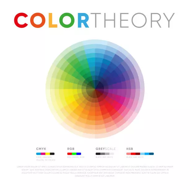
Color psychology explores how colors can influence perceptions and emotional responses. However, these associations are not universal rules.
Red often suggests energy, urgency, passion, or excitement. Therefore, brands may use it for prominent buttons or energetic campaigns.
Blue commonly communicates trust, stability, and professionalism. Consequently, many technology, finance, and healthcare brands use blue palettes.
Green can suggest nature, growth, health, or freshness. It often appears in environmental, wellness, and sustainability-focused branding.
Yellow Can Signal Optimism
Yellow often creates associations with happiness, optimism, and energy. However, excessive yellow can become visually tiring.
Designers can use yellow for highlights, accents, or attention-grabbing elements. Balanced use can create warmth without overwhelming visitors.
Orange can also communicate enthusiasm and friendliness. It may work well for brands that want an approachable personality.
Purple Can Suggest Creativity and Luxury
Purple has associations with creativity, imagination, and premium positioning. Therefore, it can support brands seeking a distinctive visual identity.
However, darker and lighter shades can create different impressions. Deep purple may feel luxurious, while lighter shades can feel playful.
Black often communicates sophistication, authority, or elegance. White can suggest simplicity, cleanliness, and openness.
Neutral Colors Provide Visual Balance
Neutral colors include shades such as gray, beige, white, and muted tones. These colors can create space around stronger brand colors.
They also improve readability when used carefully. A balanced palette prevents pages from becoming visually overwhelming.
Therefore, designers often combine one dominant color with supporting neutrals. This approach creates hierarchy without excessive visual noise.
Cultural Context Changes Color Meaning
Color meanings can vary across cultures and regions. A color associated with celebration in one culture may represent something different elsewhere.
Therefore, international brands should research audience expectations before selecting a global palette. Cultural assumptions can create unintended messages.
Research Your Target Audience
Consider where your customers live and how they interact with your brand. Review competitors within the same market as well.
Customer research can reveal useful preferences and expectations. Surveys, interviews, and user testing can provide stronger evidence than assumptions.
However, cultural research should support broader brand strategy. Do not choose colors solely because they appear popular within one region.
Color Influences Website Navigation
Color can help users understand website structure. Designers can use contrast and consistent shades to distinguish interactive elements.
For example, links can use one consistent treatment across pages. Primary buttons can maintain a recognizable color throughout the user journey.
Create a Clear Visual Hierarchy
A website should guide attention toward the most useful information. Color provides one method for establishing that hierarchy.
Use stronger contrast for important actions. Reserve accent colors for elements that deserve attention.
However, avoid giving every element a bright color. When everything stands out, nothing receives meaningful emphasis.
Color Can Influence Calls to Action
Call-to-action buttons need visibility without appearing aggressive. Color selection can affect how easily users notice these controls.
A contrasting button can stand apart from the surrounding interface. This difference can help visitors identify their next step.
Test Rather Than Guess
Designers should avoid assuming one color always produces better conversions. Context can change how users respond.
A/B testing can compare different button treatments. Measure clicks alongside completed actions to understand actual performance.
For example, a highly clicked button may still produce poor conversions. Therefore, evaluate the entire user journey rather than one metric.
Accessibility Should Shape Color Choices
Color should never carry essential information by itself. Some users experience color vision differences that make certain combinations difficult.
Therefore, designers should provide additional visual cues. Text labels, icons, patterns, and clear states can communicate information more effectively.
Maintain Strong Contrast
Text needs sufficient contrast against its background. Weak contrast can make content difficult to read, especially on mobile devices.
Design teams should test color combinations with accessibility tools. They should also check interfaces across different screen conditions.
Avoid relying solely on red and green for status indicators. Add labels or icons to make states easier to understand.
Color Consistency Strengthens Brand Recognition
A brand becomes easier to recognize when its colors remain consistent. Frequent palette changes can weaken visual memory.
Therefore, businesses should establish clear color guidelines. These guidelines can define primary colors, secondary colors, backgrounds, text shades, and accent colors.
Build a Practical Brand Palette
Start with a primary brand color that reflects your desired personality. Then, select supporting colors that complement it.
Include neutral shades for backgrounds and text. Also, define appropriate uses for each color.
A simple palette often performs better than a complicated one. Consistency matters more than having many decorative options.
Color Should Support Content and Illustrations
Web design often combines typography, photography, illustrations, icons, and interface elements. These components need visual harmony.
Color can connect separate assets into one recognizable experience. It can also reinforce the emotional message behind illustrations.
Match Color With Visual Storytelling
An educational illustration may need calm and approachable colors. A promotional graphic may benefit from stronger contrast and energetic accents.
However, the palette should remain consistent with the broader brand identity. Individual graphics should not look disconnected from the website.
Designers can also use color to direct attention within illustrations. Highlighting one element can help viewers understand the intended message.
Dark Mode Requires Different Color Decisions
Dark interfaces have become common across websites and applications. However, simply reversing colors does not create an effective dark mode.
Some bright colors can appear harsh against dark backgrounds. Therefore, designers should adjust contrast and saturation carefully.
Test Light and Dark Interfaces Separately
Review text, buttons, illustrations, and icons in both modes. Some brand colors may need modified shades for better readability.
Background colors also deserve attention. Pure black can create excessive contrast for some users.
A softer dark background can provide a more comfortable visual experience. Testing helps determine what works best for your audience.
How Businesses Can Choose Better Brand Colors
Start by defining the emotions and qualities your brand should communicate. Then, research your audience and industry expectations.
Next, review competitor palettes without copying them. Look for opportunities to create differentiation while maintaining category relevance.
Create several palette options before making a final decision. Test these options across real website layouts and marketing materials.
Evaluate Colors Across Different Touchpoints
A color may look excellent on a website but fail in printed materials. Therefore, test the palette across multiple brand applications.
Review social graphics, presentations, packaging, advertisements, and digital interfaces. Consistency should remain practical across different formats.
Also, test colors under different lighting conditions. Screen brightness can change how certain shades appear.
Measure the Impact After Launch
Color decisions should support measurable business objectives. Track engagement, conversions, navigation behavior, and user feedback after implementation.
However, avoid attributing every performance change to color alone. Website structure, content, pricing, and traffic quality also influence results.
Combine Data With Human Feedback
Analytics can show what users do. User interviews can help explain why they behave differently.
Together, these sources provide stronger design insights. Teams can then refine colors based on evidence instead of personal preferences.
Continue monitoring performance after major brand changes. Customer expectations can evolve as markets and digital habits change.
Conclusion
Color psychology can influence how people perceive brands and interact with websites. Yet, successful color choices require context, research, accessibility, and consistency.
The strongest palettes support brand personality while improving clarity and usability. They guide attention without overwhelming visitors.
Ultimately, color should serve a clear purpose within the broader design system. When strategy and creativity work together, color becomes a powerful communication tool.