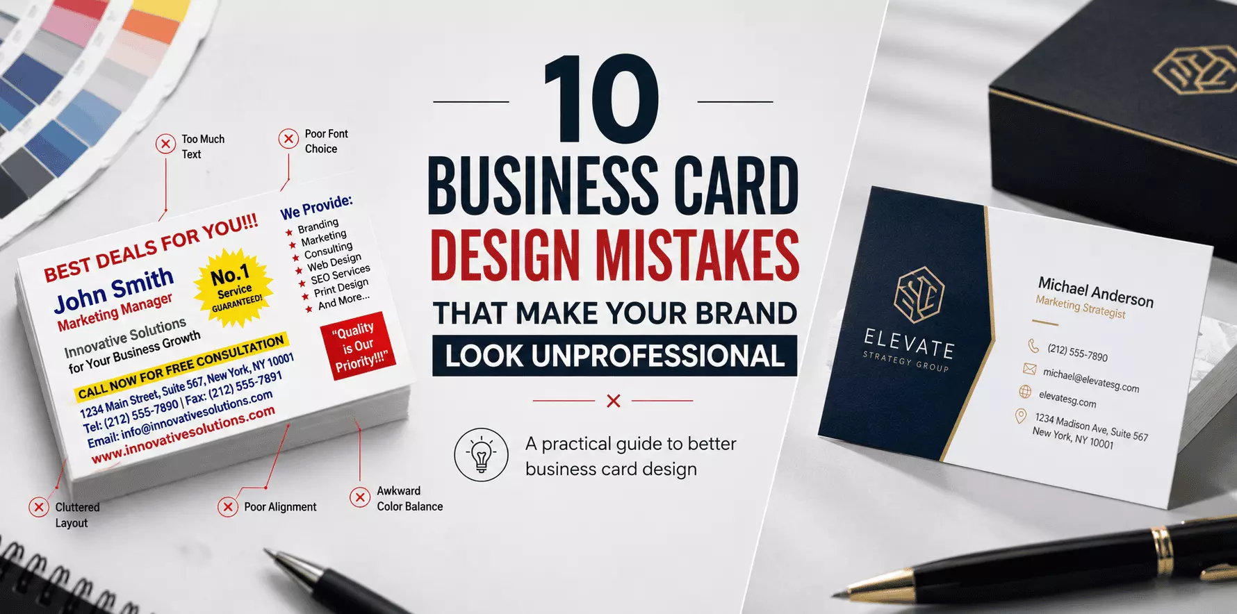
Business Card Design Mistakes to Avoid | Professional Tips
A business card is often the first physical connection between your brand and a potential customer. Even in today’s digital world, a well-designed business card helps businesses build trust, share contact information and create a memorable impression.
However, many businesses make simple design mistakes that can make their cards look outdated or unprofessional. A good business card is not only about adding a logo and contact details; it requires the right balance of design, information, colours and print quality.
In this guide, we will discuss common business card design mistakes and how to avoid them while creating a professional brand identity.
1. Adding Too Much Information on the Card
One of the most common mistakes is trying to include too much information on a small space. A business card should quickly communicate important details, not act like a brochure. Adding too many services, long descriptions or unnecessary information can make the design look crowded.
Include only essential details:
- Business name
- Logo
- Person’s name
- Phone number
- Email address
- Website
- Social media details
- QR code (if required)
A clean layout helps customers find important information quickly.
2. Using Poor Quality Images or Logos
Low-resolution logos and images can make even a good design look unprofessional. A blurry logo creates a negative impression because customers may associate poor print quality with poor business quality.
Better practices:
- Use high-resolution logos
- Avoid stretched images
- Use vector files whenever possible
- Check image quality before printing
Your logo is a major part of your brand identity, so it should always appear sharp and clear.
3. Choosing Difficult-to-Read Fonts
Creative fonts may look attractive, but they are not always practical for business cards. If customers cannot easily read your name, phone number or website, the card loses its purpose.
Follow these font guidelines:
- Use simple professional fonts
- Maintain proper font size
- Keep enough spacing between text
- Avoid using too many font styles
A professional business card should focus on readability first.
4. Using Too Many Colours
Colours play an important role in branding, but excessive colours can make a card look confusing. A professional design usually uses a limited colour palette that matches the brand identity.
Recommended approach:
- Use 2–3 main colours
- Maintain good contrast
- Match colours with your logo
- Avoid distracting backgrounds
The right colour combination makes your business card look premium and memorable.
5. Ignoring Proper Spacing and Alignment
A common mistake in visiting card design is placing elements too close together. Without enough spacing, the card can appear unorganized and difficult to read.
Good design requires:
- Balanced margins
- Proper alignment
- Clear sections
- Enough white space
A clean structure improves the overall professional appearance.
6. Choosing the Wrong Paper and Finish
Design is important, but the printing material also affects how customers perceive your brand. A poor paper choice can reduce the impact of even a great design.
Common options include:
- Standard art paper
- Matte finish cards
- Glossy laminated cards
- Premium textured cards
Choose the material based on your business type, budget and branding requirements.
7. Not Considering the Printing Size
A business card should follow standard size guidelines so it remains practical. The most commonly used visiting card size is:
2 × 3.5 inches (51 × 89 mm)
Incorrect sizing can create problems during printing, cutting and storage.
Always check:
- Final dimensions
- Bleed area
- Safe margins
- Orientation
before sending the design for printing.
8. Forgetting Important Contact Details
A business card becomes useless if customers cannot contact you.
Before printing, always verify:
- Phone number
- Email address
- Website URL
- Social media handles
- Business address
A small spelling mistake can affect your business communication.
9. Not Adding a Clear Brand Message
A business card should tell customers what your business does. Instead of only showing a company name, consider adding a short service description or tagline.
Example:
Instead of:
ABC Solutions
Use:
ABC Solutions
Digital Marketing & Web Services
This gives customers immediate understanding of your business.
Read: How Small Businesses Can Make Their Product Packaging Look
10. Ignoring Digital Features Like QR Codes
Modern business cards can connect offline networking with digital platforms.
Adding a QR code can help customers quickly access:
- Website
- Portfolio
- Social media profiles
- Google Business Profile
A QR code should always be tested before printing to ensure it works properly.
How to Create a Professional Business Card Design?
A professional business card should follow these basic principles:
Keep It Simple
Avoid unnecessary design elements and focus on important information.
Maintain Brand Consistency
Use your existing logo, colours and brand style.
Prioritize Readability
Make sure every important detail is easy to understand.
Choose Quality Printing
The right paper and finishing can improve the overall customer experience.
Cheap vs Premium Business Cards: Which One Is Right?
Feature
Standard Business Cards
Premium Business Cards
Purpose
Daily networking
Luxury branding
Paper
Standard cardstock
Special materials
Finish
Glossy/Matte
Foil, embossing, textured
Cost
Budget-friendly
Higher investment
Best For
Startups & small businesses
Premium brands
The right choice depends on your business goals and customer expectations.
Final Checklist Before Printing Your Business Card
Before sending your design for printing, check:
Logo quality
Correct contact details
Proper spelling
Readable fonts
Balanced colours
Correct card size
Suitable paper finish
QR code functionality
Conclusion
A professional business card is a small but powerful branding tool. Avoiding common business card design mistakes helps your brand create a stronger impression and improves customer trust.
By focusing on clean design, readable information, suitable materials and quality printing, businesses can create cards that represent their brand effectively.
Whether you are a startup, freelancer or established company, a well-designed visiting card can support better networking and business growth.