Beyond Flat Design: The Return of Depth and Texture in 2026 UI
Spatial Interfaces and the Evolution of Digital Tactility for Modern Users
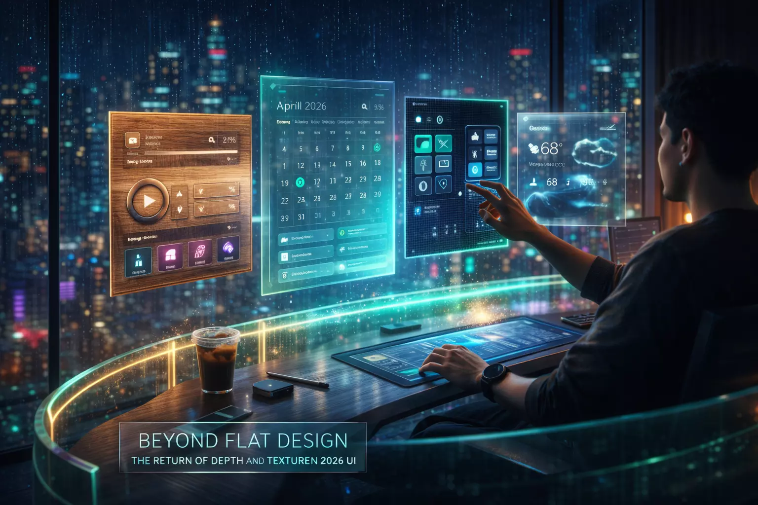
The digital landscape in 2026 has moved decisively past the era of "flat" aesthetics. As spatial computing—led by advancements in mixed reality and high-fidelity mobile displays—becomes the baseline, users increasingly crave depth, texture, and physical intuition in their interfaces.
This shift isn't merely decorative; it is a functional response to how humans process information in three-dimensional environments. By reintroducing tactile cues, designers are reducing cognitive load and creating more immersive, accessible digital experiences.
The 2026 Interface Context: Why Flat is Fading
For over a decade, flat design dominated due to its efficiency on low-resolution screens and slow data speeds. However, the 2026 environment is defined by sophisticated hardware that demands more than two-dimensional layouts.
The primary driver for this change is the "Spatial Paradox." As we move between traditional glass screens and wearable headsets, purely flat elements feel disconnected and difficult to interact with. Users now expect "affordance"—visual cues that suggest how an object should be used.
A button that looks like it has physical depth is more intuitive to "press" in a 3D space than a colored rectangle. This transition focuses on making digital objects behave like physical ones, using light, shadow, and material properties to define hierarchy.
The Core Framework: Elements of Modern Depth
To implement depth effectively in 2026, designers are moving away from simple drop shadows toward a system of "Material Logic." This involves four primary pillars:
- Dynamic Z-Axis Layering: Instead of stacking elements, interfaces now utilize a literal Z-axis. Backgrounds recede using gaussian blurs and environmental lighting, while active elements "float" closer to the user.
- Adaptive Skeuomorphism: Unlike the literal textures of 2012, 2026 depth is subtle. It uses "glassmorphism" (frosted glass effects) and "claymorphism" (soft, rounded 3D shapes) to create a sense of volume without visual clutter.
- Haptic Synchronization: Depth is no longer just visual. Modern UI integrates localized haptics that vary based on the perceived "weight" or "texture" of the digital element being touched.
- Spatial Lighting: Interfaces now feature virtual light sources that move relative to the device's orientation. This creates realistic highlights and shadows that confirm the object’s position in 3D space.
Read: Modern and Unique 3D Boundary Wall Designs
Real-World Application: Implementing Spatial Texture
Transitioning a standard mobile or web interface into a spatial-ready design requires a phased approach. In practice, this often starts with the navigation and primary action buttons.
For instance, when developing high-performance applications, such as those handled during mobile app development in Michigan, teams are increasingly utilizing "Depth-First" architectures. This ensures that as a user scales an app from a smartphone to a mixed-reality headset, the interface maintains its usability.
Step-by-Step Implementation Logic:
- Audit Contrast and Legibility: Before adding depth, ensure base colors meet 2026 accessibility standards. Depth should enhance hierarchy, not obscure it.
- Define Material Properties: Decide which elements are "solid" (high opacity, sharp shadows) and which are "ethereal" (translucent, soft blurs). Use solid materials for high-stakes actions like "Submit" or "Buy."
- Apply Environmental Lighting: Set a global light source (typically top-left) so shadows remain consistent across all screens.
- Test on Physical Hardware: Depth effects often look different on OLED vs. standard LCD. Always verify the "tackiness" or "slickness" of the UI on the target device.
AI Tools and Resources
- Spline AI: A powerful tool for generating 3D assets and spatial UI components via text prompts. It is essential for designers moving from 2D vector work into 3D environmental design.
- Luma AI (Gen-3): Useful for capturing real-world textures and converting them into high-fidelity digital skins. Best for brands wanting a "hyper-real" tactile feel in their interfaces.
- Attention Insight: An AI-driven heat mapping tool that predicts where users will look in a 3D space. It helps verify if your depth cues are actually drawing attention to the right places or just creating noise.
- Midjourney v7 (Texture Maps): While primarily an image generator, the latest versions allow for the creation of seamless, high-resolution displacement maps that can be applied to UI buttons and backgrounds for realistic texture.
Risks, Trade-offs, and Limitations
Adding depth and texture comes with significant performance costs. High-resolution blurs and real-time lighting calculations can drain mobile batteries and increase latency on older hardware.
The "Visual Noise" Failure Scenario:
In early 2025, several major fintech apps attempted to go "full spatial" by adding heavy textures to every card and button. The result was a disastrous increase in user error rates. Because every element had a shadow, nothing stood out as the "Primary Action." Users reported "visual fatigue" within three minutes of use.
The lesson for 2026 is clear: Depth is a currency—spend it wisely. If every element is 3D, the interface becomes as flat as if it had no depth at all. Use texture sparingly to highlight critical paths and keep secondary information simple.
Key Takeaways for 2026
- Function over Fashion: Use depth to solve usability problems, such as distinguishing between overlapping windows or indicating "pressable" states in MR.
- Maintain Performance: Optimize blurs and shadows. Use CSS-based depth effects where possible rather than heavy image assets to keep load times under 1.2 seconds.
- Future-Proof for XR: Even if your current project is strictly mobile, designing with a Z-axis mindset ensures your UI is ready for the inevitable shift toward wearable spatial computers.
- Accessibility First: Ensure that depth cues are not the only way information is conveyed. Use color, labels, and haptics to support users with visual impairments.