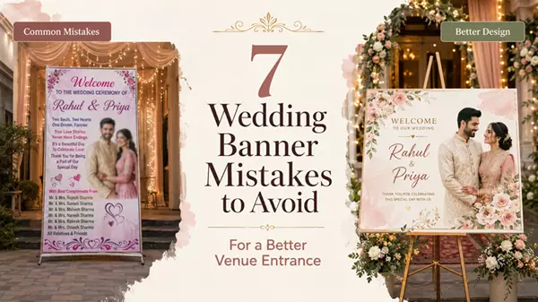
7 Wedding Banner Mistakes to Avoid for a Better Venue Entrance
A wedding banner is often one of the first personalised details guests notice at a venue. It introduces the couple, supports the wedding theme and helps the entrance feel connected to the celebration.
However, even a beautiful design can look weak if the size is wrong, the photo is unclear or the layout is too crowded. Avoiding these wedding banner mistakes can help create a cleaner, more balanced and more welcoming venue entrance.
1. Choosing a Banner Without Measuring the Space
A frequent mistake is selecting a banner before checking the available display area.
A banner that is too small may look lost on a wide entrance. A banner that is too large may cover flowers, drapes or decorative structures. The right size depends on the width, height, installation method and viewing distance.
Before finalising the size, measure the exact area where the banner will be placed. Also check where eyelets, ropes or supports will be attached. A compact welcome display may work well on an easel, while a gate or stage usually needs a wider format.
A design may look perfectly balanced on a laptop but feel too small once installed several feet above the entrance.
2. Using a Low-Quality Couple Photo
Photos often look clear on a phone screen but become blurry when enlarged for printing.
Screenshots, social-media downloads and images forwarded several times through messaging apps are usually compressed. When printed in a large format, faces may appear soft, pixelated or unclear.
Use the original image file whenever possible. Choose a bright, properly focused photograph with enough space around the couple. Avoid heavy filters, very dark photos and images with important details cropped too closely.
A clear photo improves the entire design, even when the layout itself is simple.
3. Adding Too Much Text
A wedding banner does not need to include every event detail.
Families sometimes try to add several photos, both family names, venue details, a long message, hashtags and multiple dates. This can make the layout difficult to read, especially from a distance.
In most cases, the most important details are enough:
- Couple’s names
- One clear photograph
- Wedding or reception date
- A short welcome message
Extra information should be added only when it has a clear purpose. A simple layout usually looks more elegant and keeps the main details visible.
4. Choosing Colours That Do Not Match the Venue
The banner should feel like part of the wedding setup, not a separate item added at the last moment.
Colours that clash with the flowers, drapes, lighting or stage décor can make the entrance look unbalanced. A good design usually follows the same colour family as the venue decoration.
For example, soft cream, blush pink, gold or pastel tones may work well with elegant floral décor. Traditional red, maroon or gold may suit a more festive Indian wedding setup.
Contrast is also important. Names and dates should remain easy to read against the background.
Read: Customizable Wedding Invitation Card Templates
5. Placing Important Details Too Close to the Edges
Text and photos placed near the outer edges may be covered during installation.
Eyelets, ropes, folds, frames or holders can hide names, dates or parts of the couple’s faces. This can happen even when the design looks correct on screen.
Keep a safe margin around all important elements, especially:
- Couple’s faces
- Names
- Dates
- Monograms
- Decorative borders
The central information should remain visible even after the banner is hung or fitted to a structure.
6. Ignoring Viewing Distance
Text size should depend on where the banner will be placed.
A small indoor welcome board can use finer details because guests will stand close to it. A wedding gate or stage banner needs larger names and clearer text because it may be viewed from several metres away.
Decorative script fonts can work well for the couple’s names, but supporting text should remain simple and readable.
Reviewing a few custom wedding banner examples can make it easier to compare layouts, photo placement and size options before finalising a design.
Material choice also matters. Flex is often suitable for larger displays, while canvas may work better for smaller indoor welcome boards where the texture is visible up close.
7. Forgetting to Check Names and Dates
A spelling mistake can make a personalised banner unusable.
Before approving the design, verify:
- Spelling of both names
- Wedding and reception dates
- Venue details
- Family names
- Event timings
- Hashtags
- Punctuation
Ask another family member to review the final artwork. A fresh pair of eyes may notice an error that others have missed.
It is also important to check the design at full size on screen, not only as a small preview.
A Simple Checklist Before Printing
Before approving the wedding banner, ask:
- Does the size fit the installation area?
- Is the photo clear enough for large printing?
- Can the names be read from a distance?
- Do the colours match the wedding theme?
- Is there enough space around the edges?
- Are all names and dates correct?
- Does the layout look simple and balanced?
Conclusion
A successful wedding banner should fit the space, use a clear photo and communicate only the essential details.
Careful planning before printing can help the design look balanced, readable and connected to the venue. The banner does not need to be large or heavily decorated to make an impact. It simply needs the right size, a clean layout and accurate information.
When these details are handled well, the entrance feels more personal and the banner becomes a natural part of the wedding photographs.